Product Design
Dimensions Vary
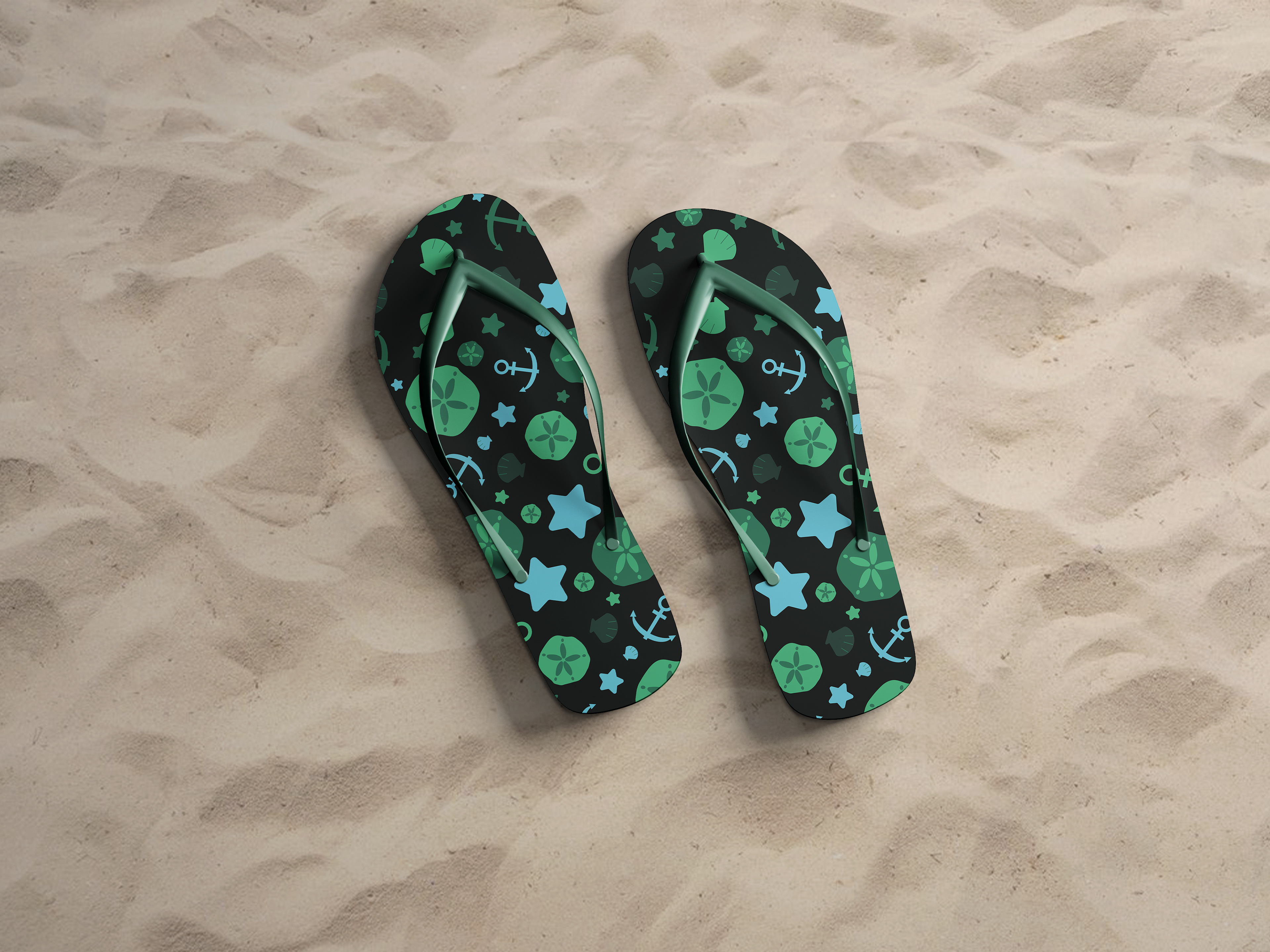
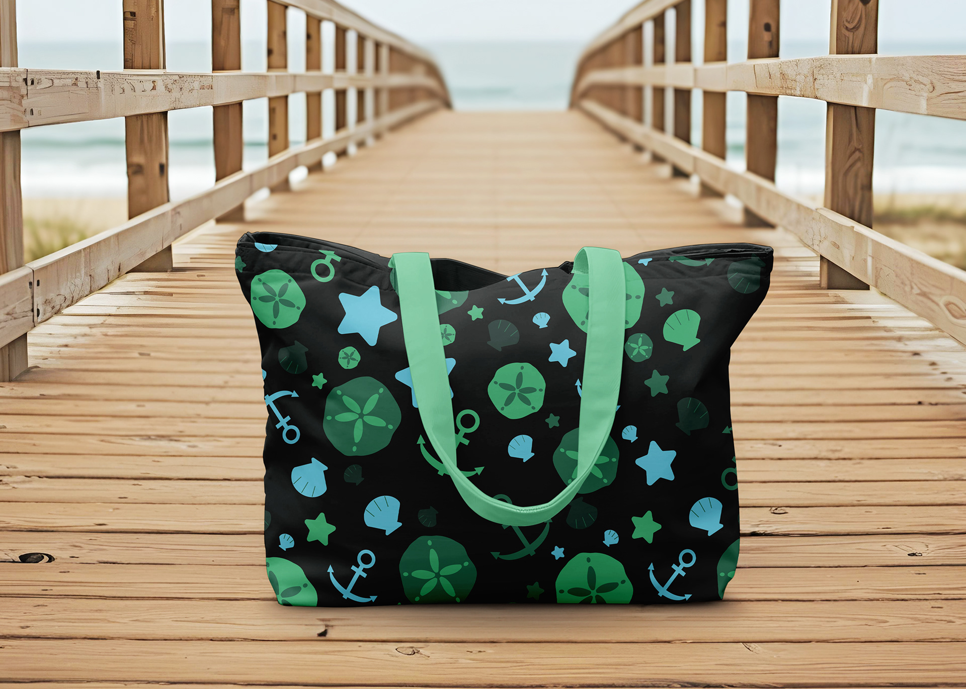
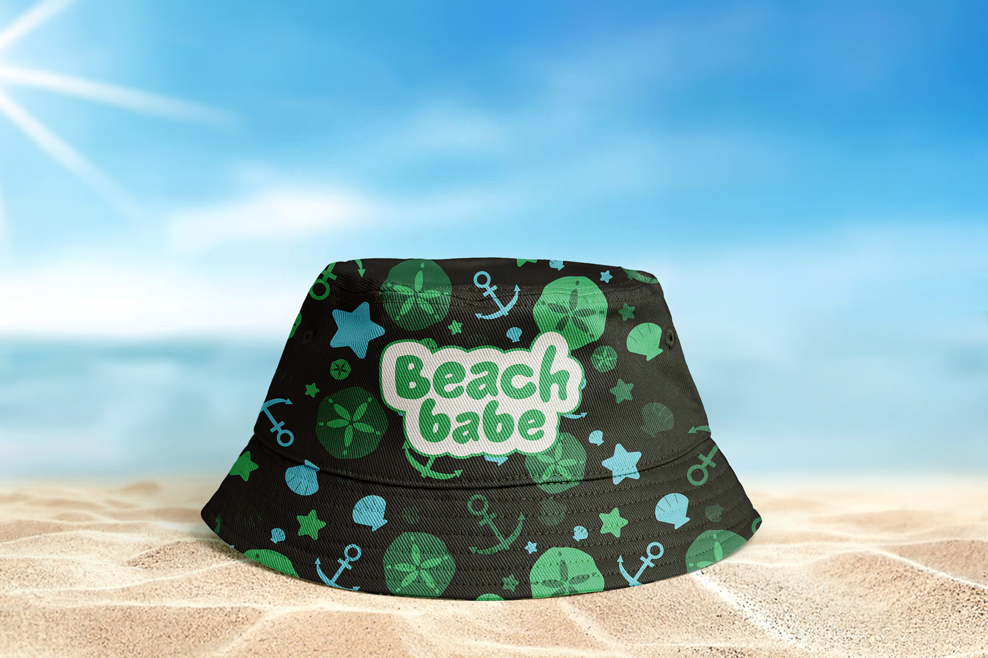
Nautical-inspired repeat pattern and custom logotype for the brand Beach Babe emphasizing movement, strong contrast, and friendly forms.
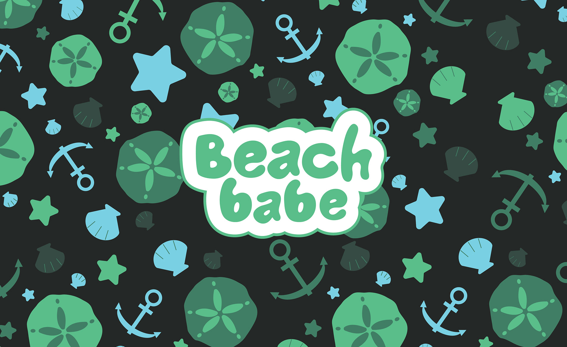
Nautical-inspired repeat pattern and custom logotype developed for the brand Beach Babe, emphasizing movement, strong contrast, and approachable forms. The pattern incorporates illustrated nautical symbols rendered in a monochromatic palette that references water while maintaining clear visual contrast in a beach setting. Limiting the color range allows for tonal variation while preserving overall cohesion across the visual system.
The brand logotype is derived from the typeface Jumble and customized to introduce a more organic, hand-drawn, friendly quality. Refining the letterforms allows the mark to feel distinctive while grounded in its typographic foundation. The project explores how a consistent color structure, pattern, and customized typography can establish a cohesive brand identity across retail applications.
How it started:
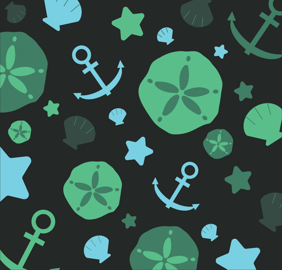
The project begins as a color theory study centered on building a harmonious palette. A monochromatic scheme generated in Adobe Color shapes the visual direction from the start. The limited range of one hue leads to nautical imagery, as subtle shifts in tone suggest water and coastal references.
Vector illustrations of simple nautical forms are developed in Illustrator and arranged into a repeat pattern. As the pattern takes shape, it expands into a conceptual brand applied to beach-related products. The transition from color study to brand system demonstrates how palette, motif, and repetition work together to form a cohesive visual identity.
Collateral Applications