
Packaging
8 x 4 x 10 inches
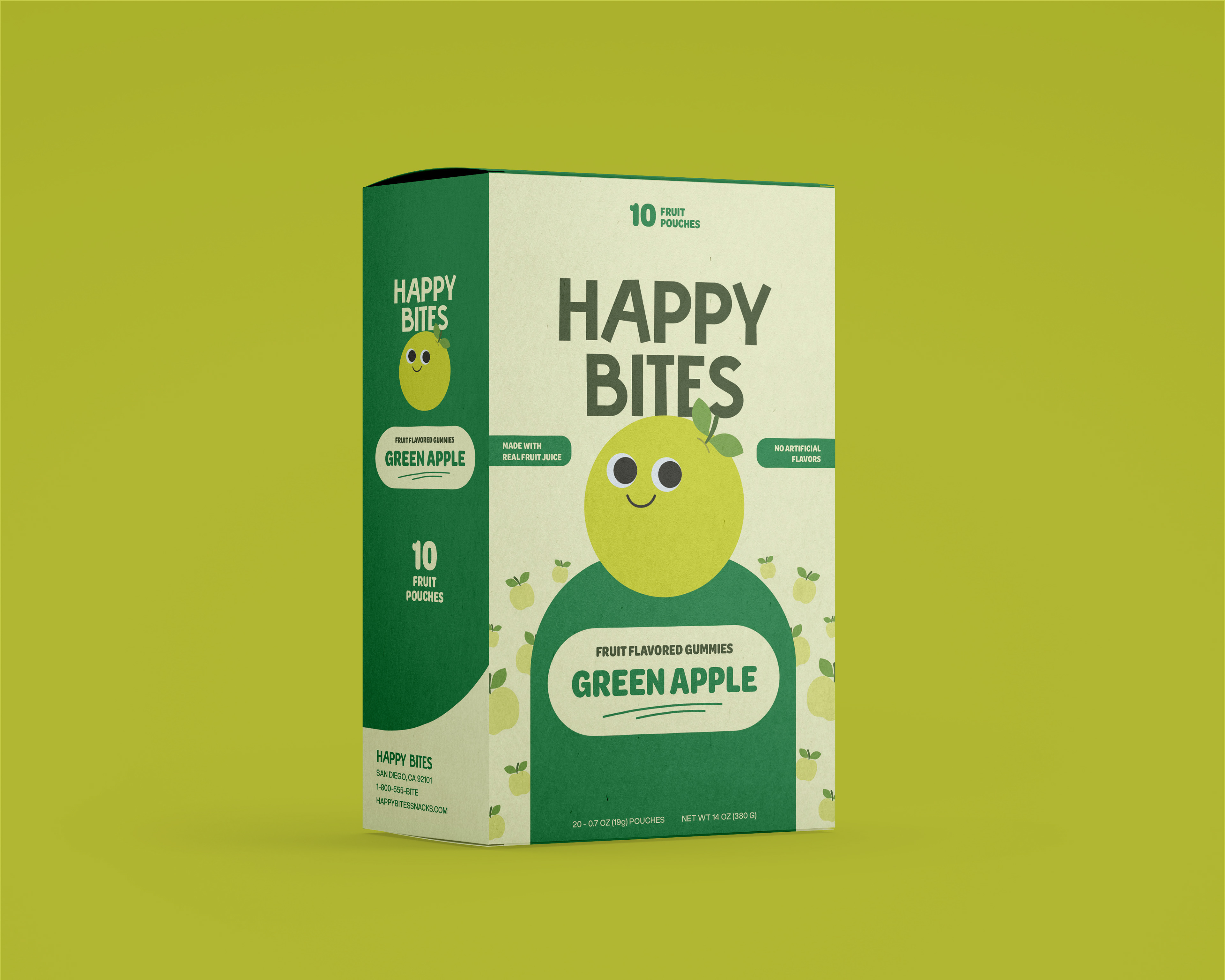
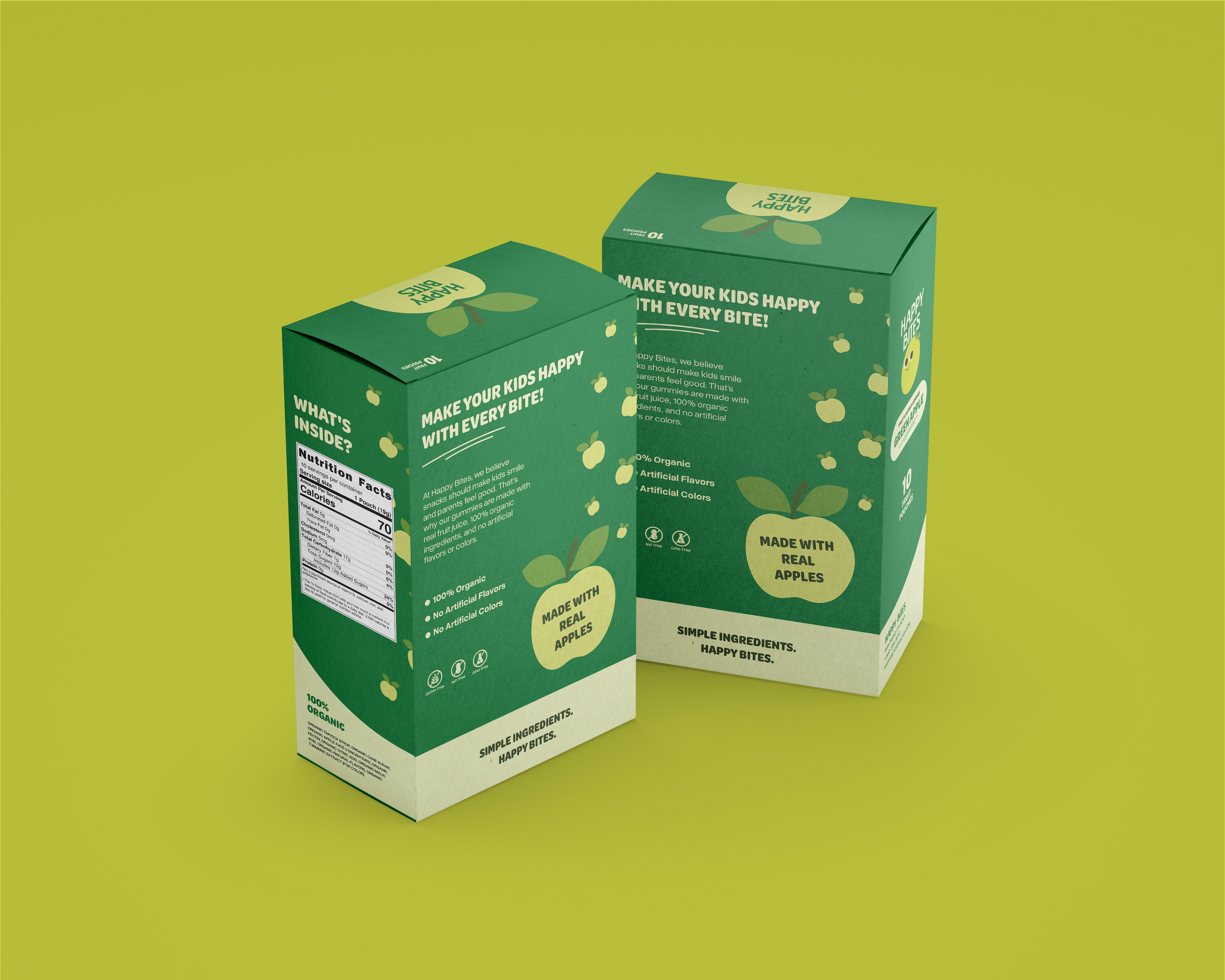
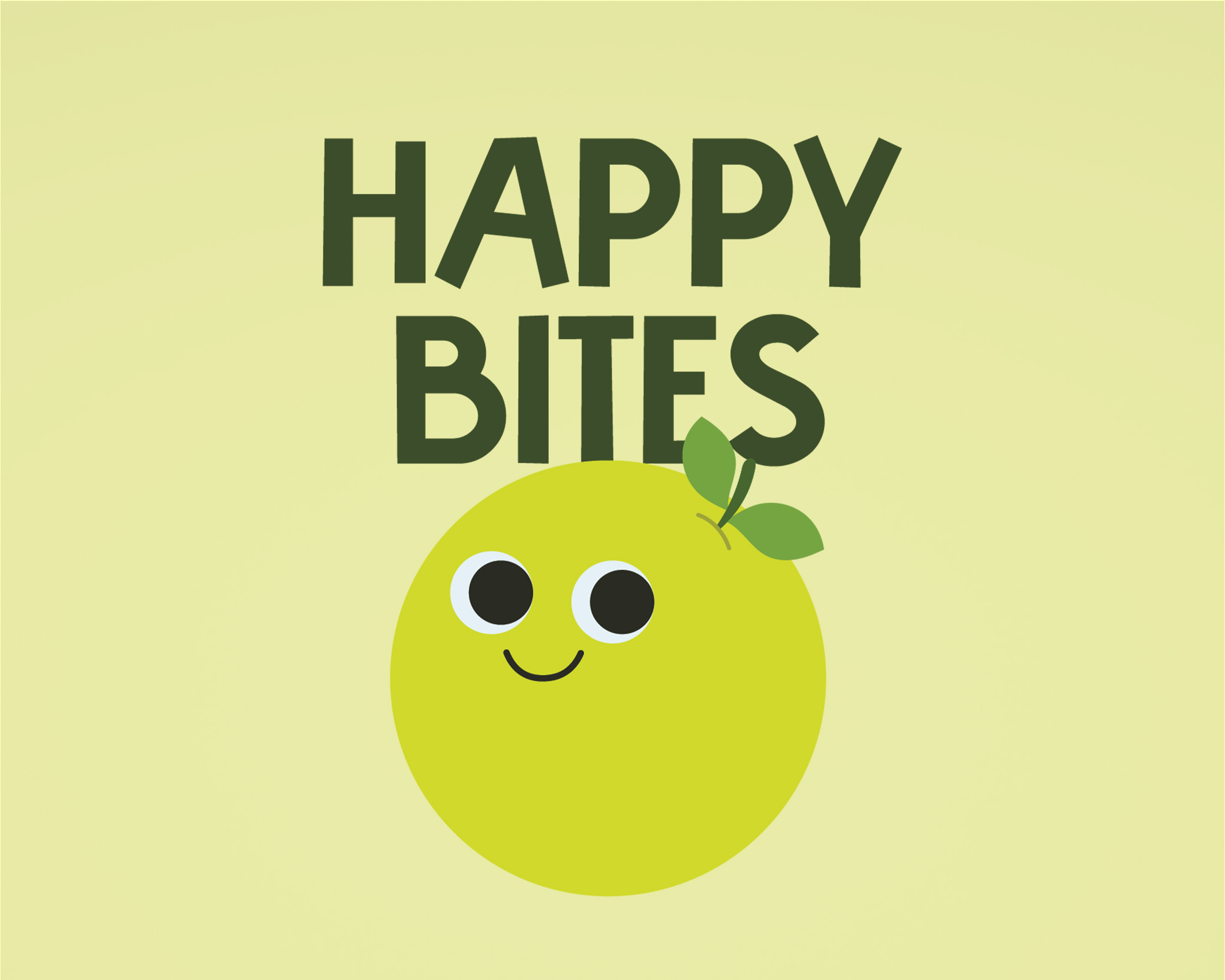
Brand identity and packaging design for Happy Bites, a children’s gummy snack brand.
Happy Bites is a children’s gummy brand using simple illustrations to establish
a playful and approachable visual identity suited for a child-oriented food product. The product is positioned as a 100% natural and organic snack made without artificial flavors, targeting parents seeking healthier sweet options for their children.
a playful and approachable visual identity suited for a child-oriented food product. The product is positioned as a 100% natural and organic snack made without artificial flavors, targeting parents seeking healthier sweet options for their children.
The logo and packaging system emphasize bold typography, simplified
forms, and a bright, monochromatic color structure to create a fun and accessible tone.
forms, and a bright, monochromatic color structure to create a fun and accessible tone.
A character based logo mascot and repeated fruit motifs reinforce flavor recognition while maintaining visual consistency across the package surface. The packaging balances child-friendly visual appeal with clear information hierarchy to communicate product benefits and flavor
distinctions within a retail environment.
distinctions within a retail environment.
How it Started
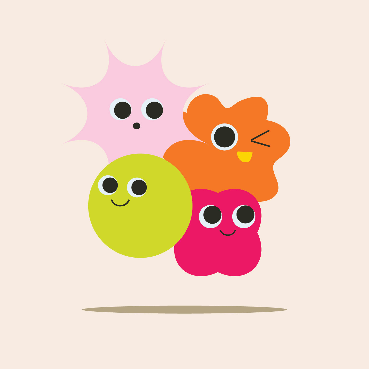
Happy Bites began with a simple exploration of vector shapes. While experimenting with playful forms and friendly character designs, a group of bright, rounded shapes with expressive faces was created. The simplicity and personality of these shapes led to the suggestion that they could easily translate into something made for children. Inspired by that idea, the concept was further developed by turning one of the characters into a gummy snack brand for kids. The green shape was chosen as the starting point and turned into a green apple flavored gummy, which helped shape the visual identity and playful direction of the Happy Bites brand.