
Packaging Design
13 x 11 x 4 inches
Comic Stash convention merchandise box design featuring a mascot and comic-inspired surface graphics.
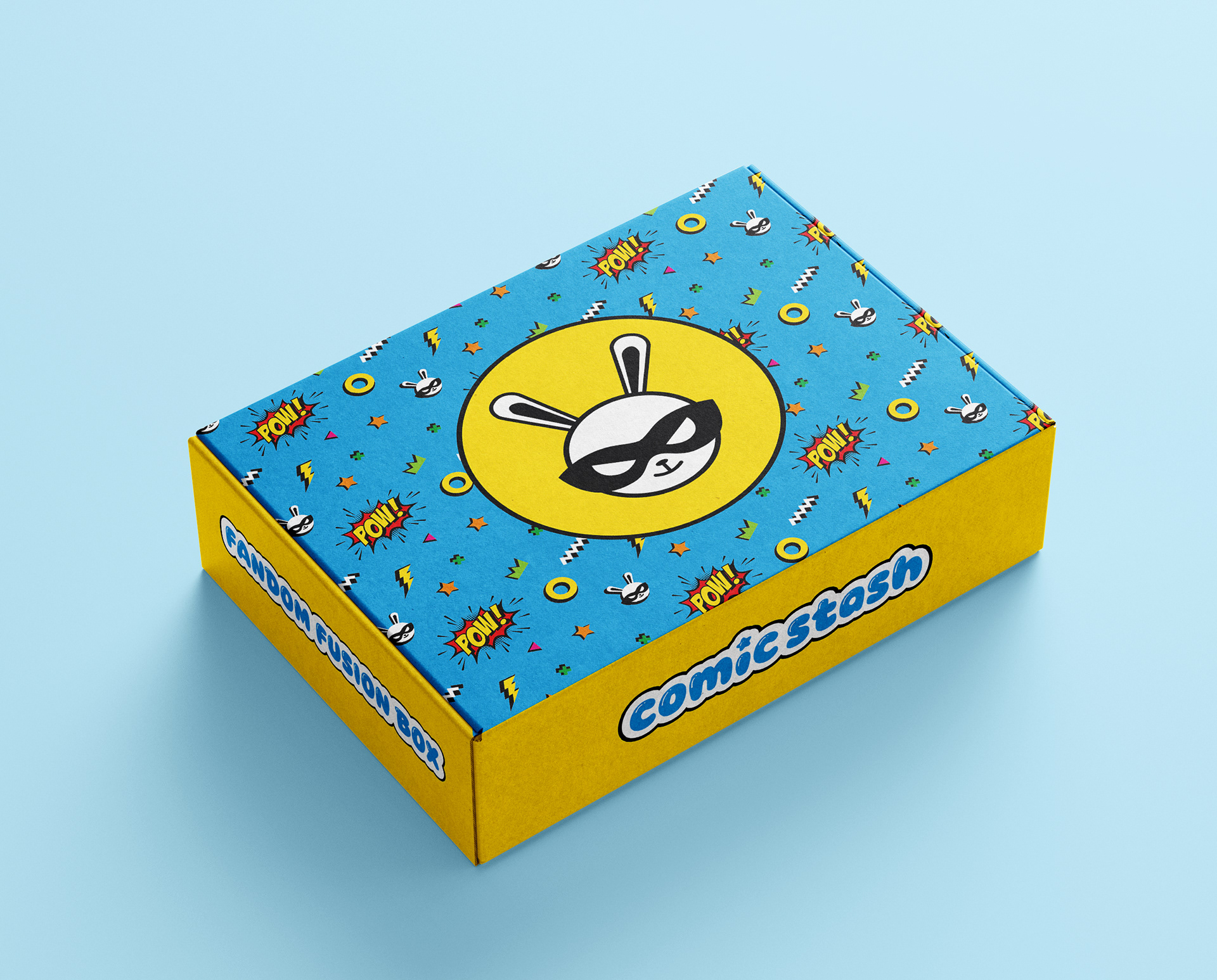
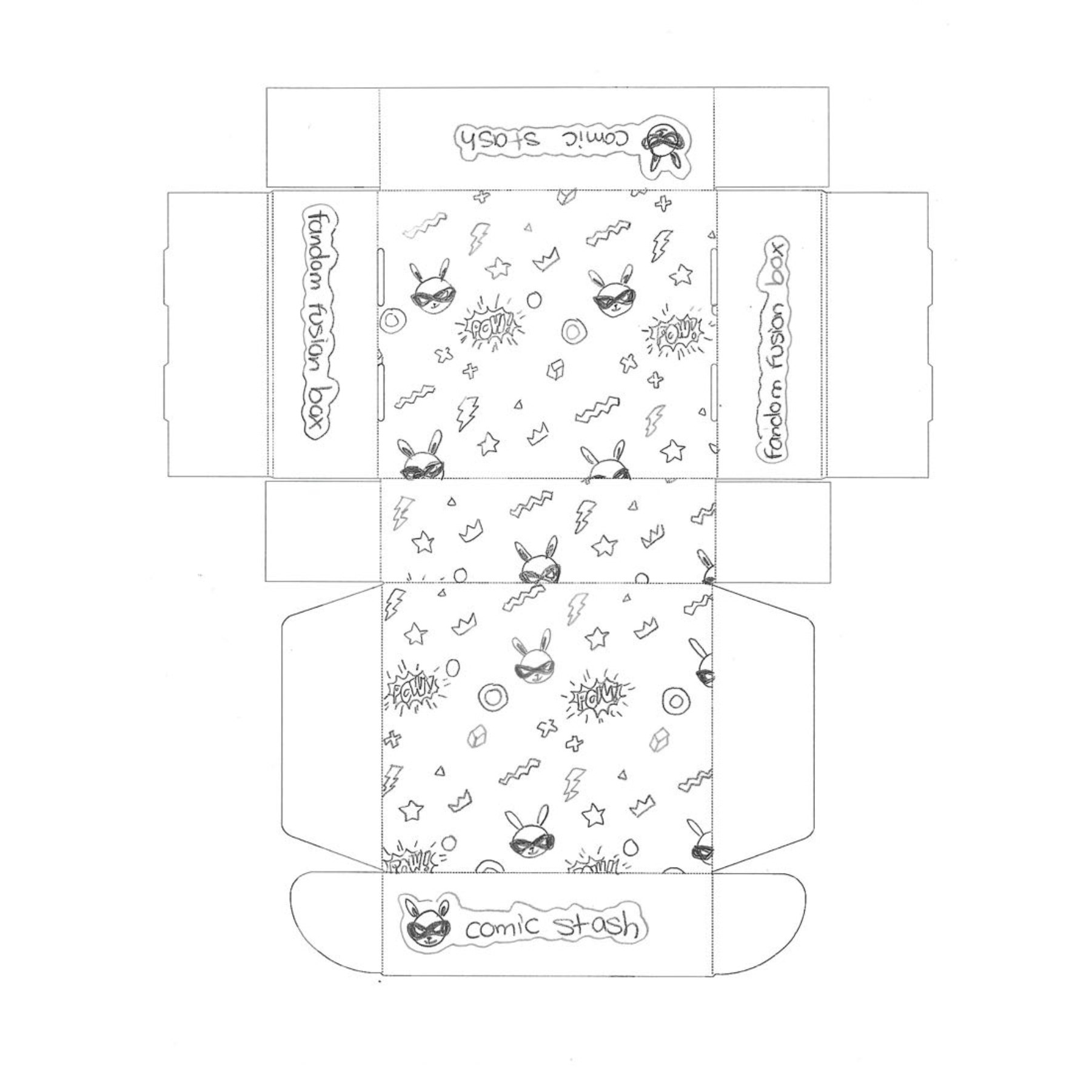
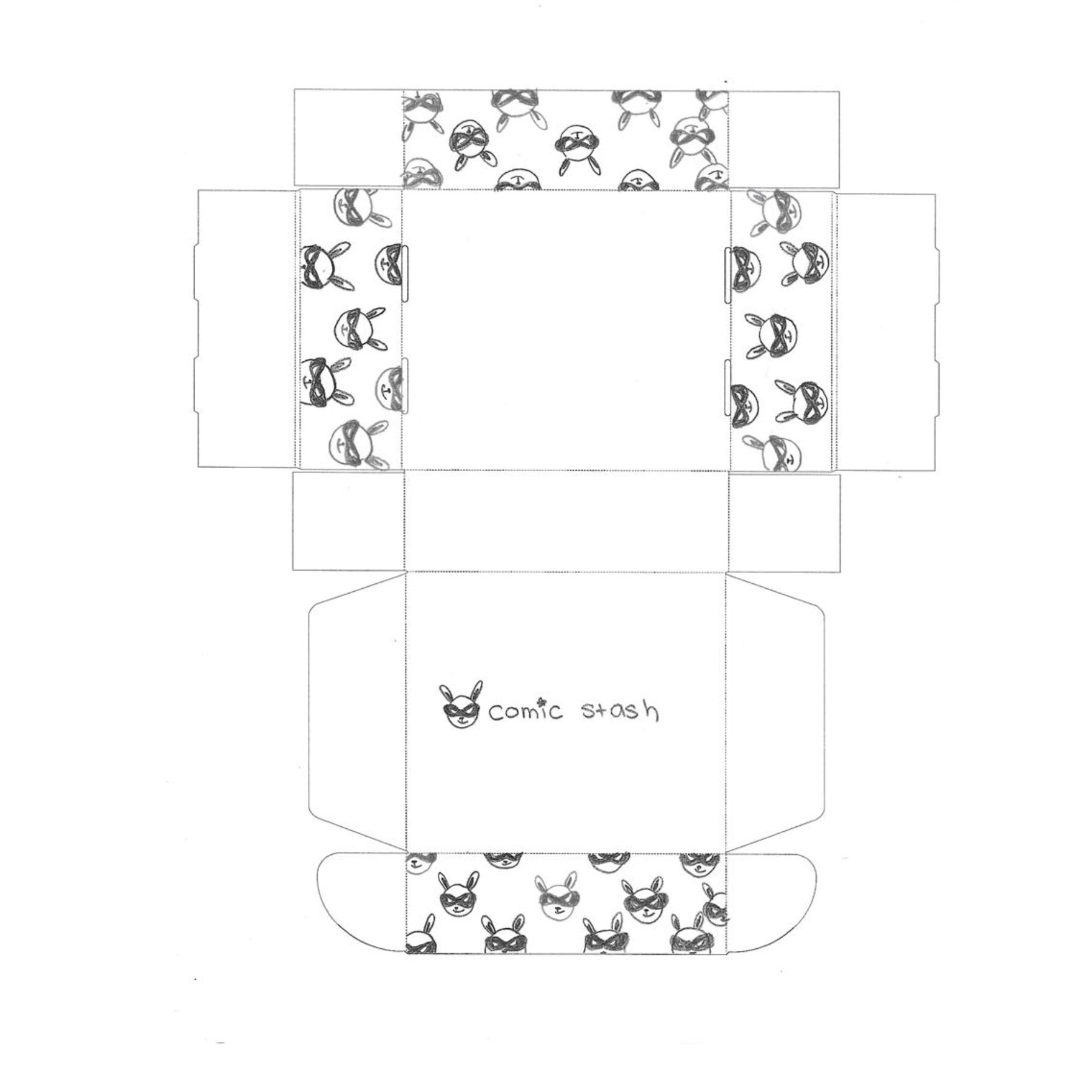
The Fandom Fusion Box is a specialty package created for Comic Stash as a limited convention merchandise item. The concept centers on combining visual references from anime, comics, K-pop, and cosplay into a single cohesive system.
The exterior features a repeat pattern built from comic-inspired elements such as “POW” graphics, lightning bolts, and geometric shapes. Black shadows are applied to these elements to reference traditional comic styling and create contrast against the bright color palette.
A custom mascot, Tempo the Bunny, is used as the central graphic element. The character draws from kawaii, or cute, visual language commonly seen in Japanese and Korean design, while the mask introduces a superhero reference that connects back to comic culture.
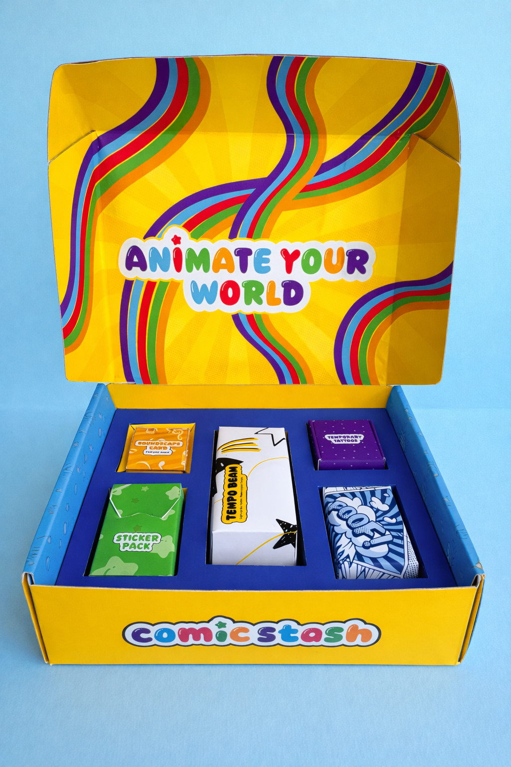
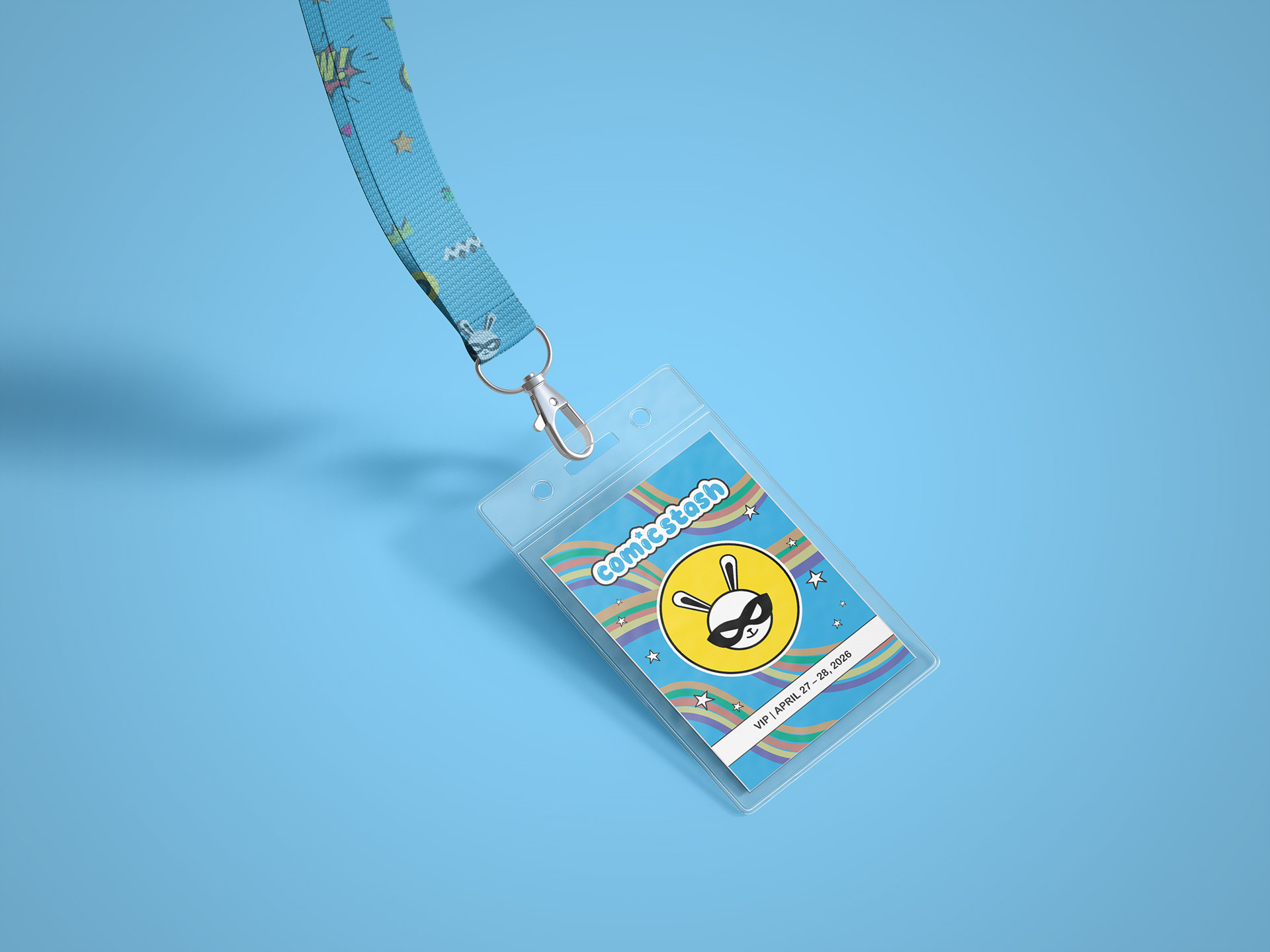
The packaging functions as both a collectible and a container for convention materials. The box includes a lanyard designed to be worn by attendees, extending the identity beyond the packaging itself. The project explores how character design, pattern, and color can work together to create a unified visual system across a themed merchandise experience.
Initial Box Designs
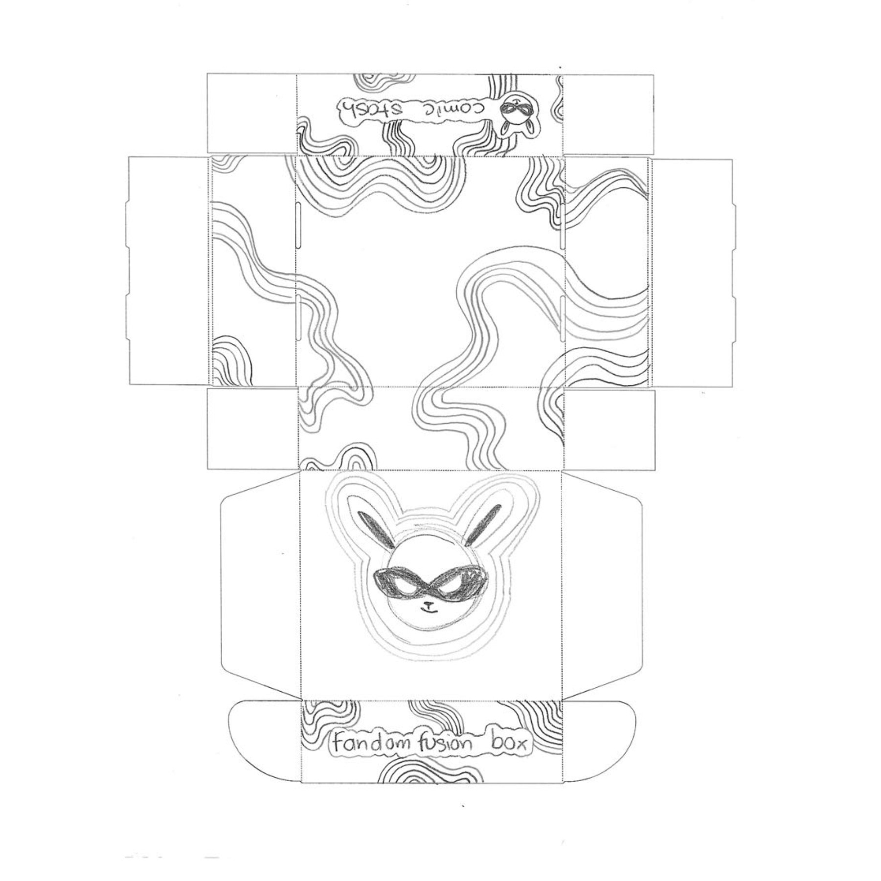
The design process for the Comic Stash Fandom Fusion Box begins with three initial sketches that explore different visual directions and structural approaches. Each concept focuses on balancing bold, fandom-inspired graphics with a cohesive unboxing experience. The final design emerges as a hybrid solution, combining the strong exterior graphics from the second concept with the dynamic swirl patterns from the first concept for the interior. This approach creates a visually engaging exterior while delivering a playful and immersive experience on the inside.
Logo Designs
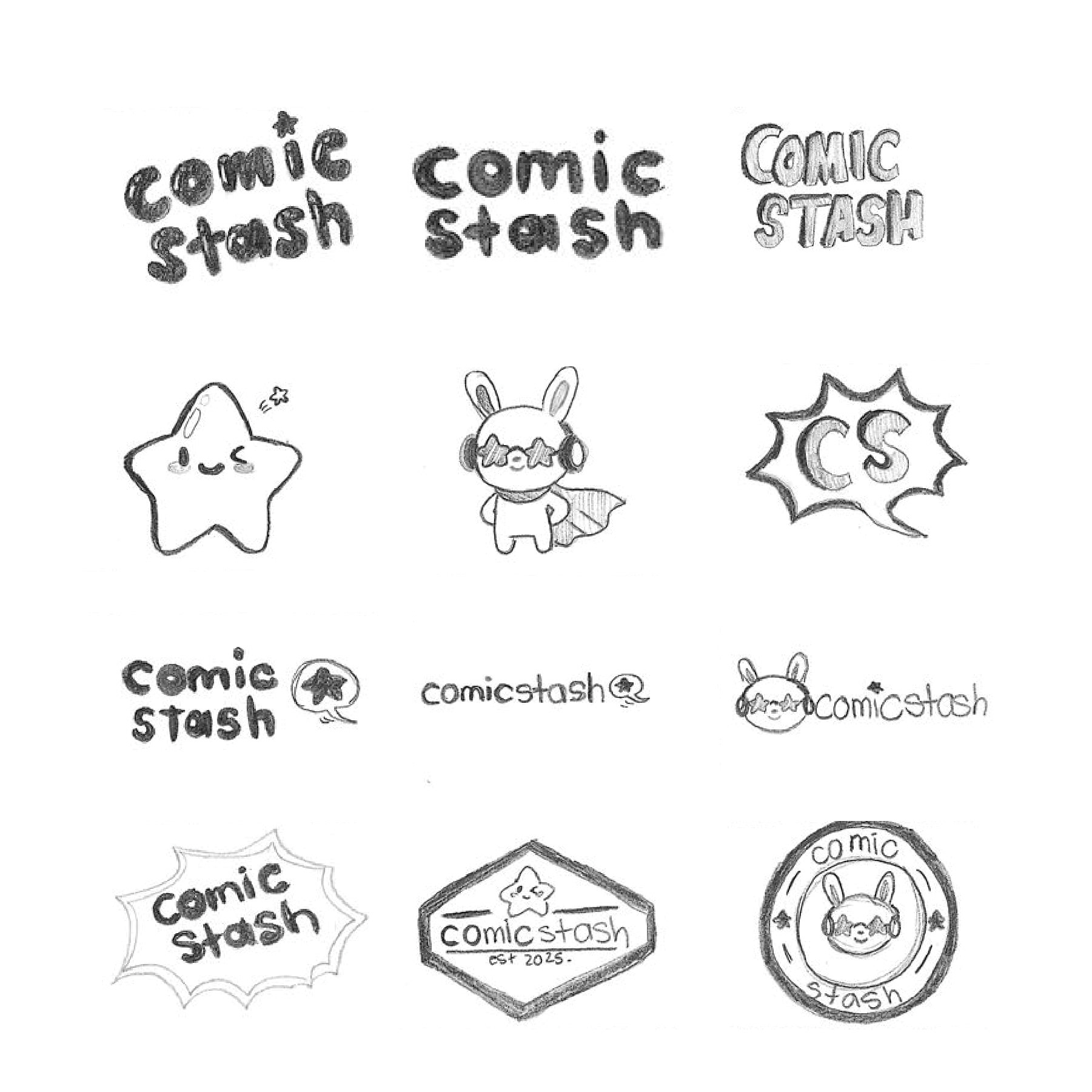
The logo development process begins with exploration through sketching. A total of twelve initial concepts are created, including three variations each of wordmarks, symbols, combination marks, and emblems. This stage focuses on generating a wide range of visual directions while experimenting with form, typography, and brand personality.
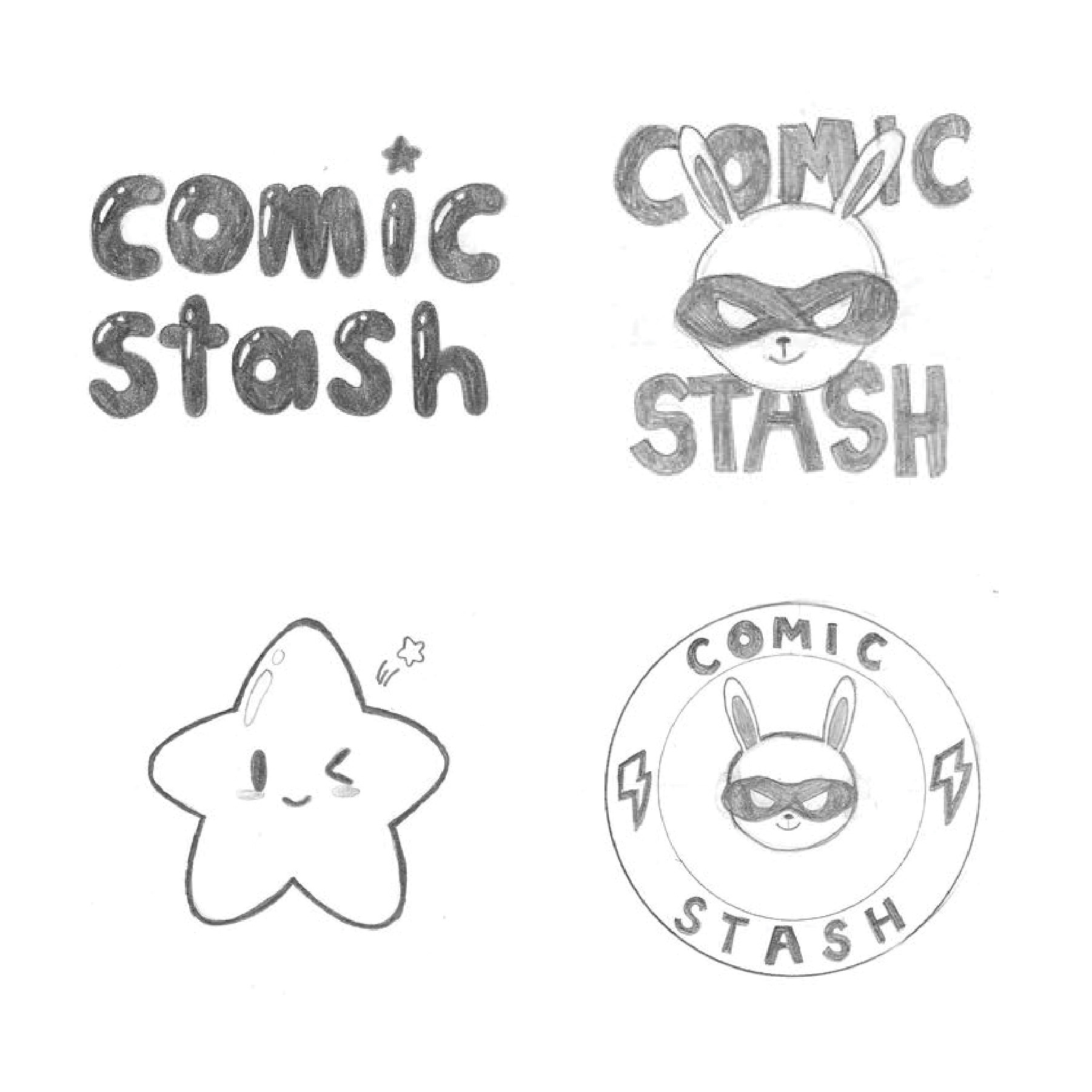
The next phase focuses on refinement and selection. The twelve initial sketches are narrowed down to four stronger concepts, with one representative design chosen from each logo category. These selected sketches are then further developed and redesigned to enhance clarity, balance, and overall visual impact.
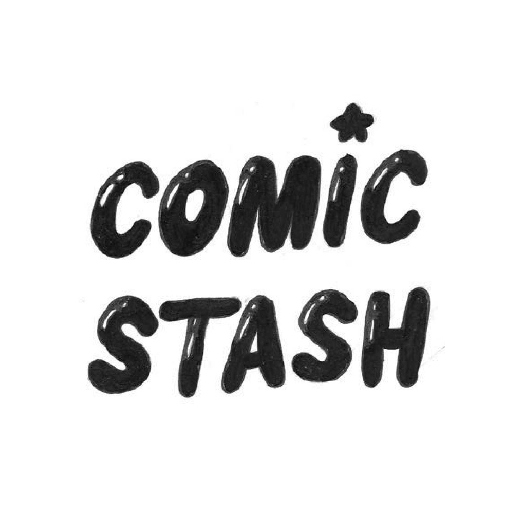
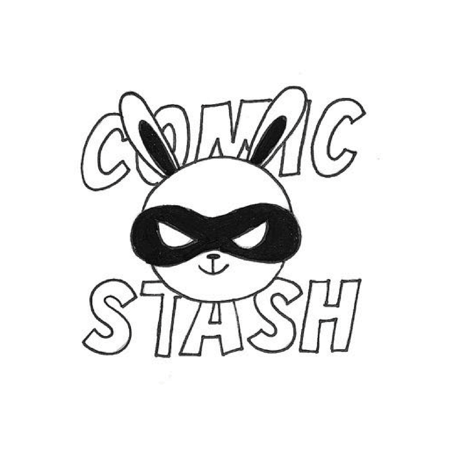
The third step centers on final evaluation. Two logos are selected from the refined set of four and are inked using black marker to replace the original pencil sketches. This process strengthens line quality and contrast, allowing for a clearer representation of how the logos will appear in their finalized form.
Final Logo
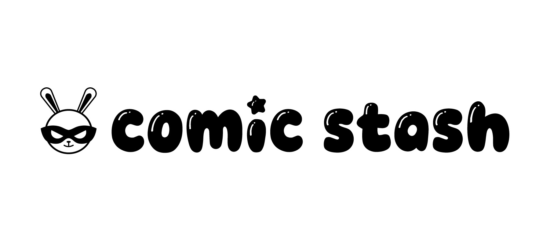
The final logo is a combination mark that integrates both typography and imagery. It features the “Comic Stash” name in the bubbly “Game Bubble” typeface paired with a mascot, creating a cohesive and playful identity that reflects the brand’s energetic and fandom-driven concept.